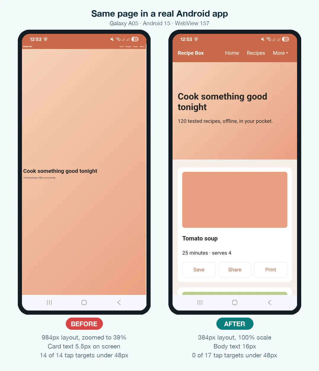
An HTML page is ready to become an APK when it lays out at the phone's own width and works with a thumb. In practice, that means seven things. Add a viewport meta tag. Replace fixed widths with fluid ones. Use 16px body text. Make every tap target at least 48px. Replace hover-only menus. Keep wide tables in their own scroll box. Don't size screens that contain form fields with vh units. Skip the first one and nothing else matters: in our test app, a desktop-style page without the tag was laid out 984px wide and shrunk to 39%, so its 14px text appeared just 5.5px tall on the phone.
This guide covers the layout side of a conversion. If you haven't converted anything yet, start with how to convert HTML to an APK for the full process, then come back before you build.
Why a page that "works on mobile" can still fail in an app
An Android app built from HTML shows your page in a WebView, the same Chromium engine as Chrome, embedded in an app. Many converters, this one included, turn on two WebView settings so that ordinary desktop websites still fit on screen: a wide viewport and overview mode. When a page doesn't say how wide it wants to be, the WebView lays it out at a desktop width of about 980 CSS pixels. Then it zooms out until that width fits the phone.
In a browser, people live with this: they pinch, or tap "desktop site". In an app, there's no address bar, no reader mode and no escape. The tiny layout is the app. And a store reviewer opening it for the first time sees the same thing.
How we tested
We built a small recipe page twice. The before version uses common desktop habits. The after version applies every fix in this guide. Open both on your phone to compare. We bundled both pages into a real Android app, built with the same runtime this site uses, and installed it on a Samsung Galaxy A05 (Android 15, Android System WebView 157, a screen 384 CSS pixels wide). We took every screenshot from the phone. The numbers come from Chrome DevTools connected to the app's WebView, and every tap was a real tap on the screen. We also ran the same pages through Chrome 157's mobile emulation at 360px. The emulator agreed on layout and text size, but it missed three problems that only the phone showed. Those are marked below.
| Measurement (Galaxy A05) | Before | After |
|---|---|---|
| Layout width | 984px, shown at 39% | 384px, shown at 100% |
| Card text as it appears on screen | 5.5px | 16px |
| Main heading on screen | 17.2px | 28px |
| Tap targets smaller than 48px | 14 of 14 | 0 of 17 |
| Smallest tap target | 5.4px | 48px |
| "More" menu | Opens on tap, links about 5px tall | Opens on tap, 48px rows, closes on a tap outside |
| Tapping the email field | Zoom jumps from 39% to 100%, button pushed off-screen | No zoom jump, email keyboard appears |
| Sideways page scroll | — | None at 320px, 384px and 800px (landscape) |
Step 1 — Add the viewport meta tag
This one line tells the WebView to lay the page out at the device's width instead of the 980px fallback. Put it in the <head> of every HTML file in your project, not only index.html. Each page you navigate to is read on its own.
<meta name="viewport" content="width=device-width, initial-scale=1">
width=device-widthis the part that matters. On its own it took our layout from 984px to the phone's 384px.initial-scale=1starts the page at 100% instead of zoomed out.
Leave zoom on. Don't add user-scalable=no or maximum-scale=1. Pinch-zoom is how people with low vision read small details, and a well-built page never forces anyone to use it anyway.
This matters even if your CSS is already responsive. Media queries respond to the layout width. Without the tag, that width is 980px, so a @media (max-width: 600px) rule never runs inside the app.
Step 2 — Replace fixed widths with fluid ones
Desktop templates usually wrap everything in a fixed container such as width: 960px. Make it fluid with a maximum, and give it side padding so text doesn't touch the edge of the glass:
*, *::before, *::after { box-sizing: border-box; }

.wrap {
  width: 100%;
  max-width: 960px;
  margin: 0 auto;
  padding-left: 16px;
  padding-right: 16px;
}

/* Cards: as many 260px+ columns as fit, one column on a phone */
.grid { display: grid; grid-template-columns: repeat(auto-fill, minmax(260px, 1fr)); gap: 16px; }

/* Images shrink with their column and keep their shape */
img { max-width: 100%; height: auto; }
Keep the width and height attributes on your <img> tags even after you make images fluid. The engine uses them to reserve space before the image loads, so text doesn't jump down as pictures arrive. Large photos are also the main reason HTML apps get big. Converting them to WebP usually cuts them to a fraction of the size with no visible difference.
Be careful with env(safe-area-inset-*) inside an app. Many mobile guides tell you to pad your header with env(safe-area-inset-top). On our Galaxy A05, the app's WebView reported a 32px top inset and a 48px bottom inset, with or without viewport-fit=cover, even though the app already keeps the page between the status bar and the navigation bar. Our first "after" page used that padding and showed an empty 32px band under the status bar. The emulator reported zero and showed nothing wrong. If your app already sits between the system bars, as apps built here do, leave the insets out. Use them only when your app draws the page edge to edge, and check the result on a real phone.
Step 3 — Use readable text sizes
Set body text to 16px, with a line height around 1.5. Let headings scale with the screen but stop at sensible limits:
html { -webkit-text-size-adjust: 100%; text-size-adjust: 100%; }
body { font-size: 16px; line-height: 1.5; }
h1   { font-size: clamp(28px, 7vw, 44px); line-height: 1.15; }
On a 360px screen, clamp() gives the heading 28px (7% of 360 is 25px, so the 28px floor wins). In landscape it grows to the 44px cap. The text-size-adjust line keeps your font sizes exactly as written.
If your design pulls fonts from a CDN such as Google Fonts, download the font files into your project. A bundled app may open with no connection, and the fallback font will change your line lengths. Our HTML project structure guide shows where those files go.
Step 4 — Make every tap target at least 48px
Android's accessibility guidance asks for touch targets of at least 48×48dp, and on a phone 1 CSS pixel equals 1dp. Desktop links are often 13px of text with no padding. In our before page, every one of the 14 links and buttons was under 48px, and the smallest was 5px on screen. Give interactive elements height and padding instead of relying on the text:
nav a, .actions a, button, input, select {
  min-height: 48px;
  display: inline-flex;
  align-items: center;
  padding: 0 12px;
  touch-action: manipulation;   /* no double-tap-to-zoom wait */
}
body { -webkit-tap-highlight-color: transparent; }  /* add your own :active style instead */
Space neighbouring targets at least 8px apart. A row of "Save / Share / Print" links that sit 8px apart in 12px text is three chances to hit the wrong one.
Step 5 — Replace hover-only menus
Touchscreens have no hover, so Android fakes one. On our test phone, a tap did open the desktop page's hover-only "More" menu. But its links were about 5px tall, and how a faked hover behaves isn't something you can rely on: in Chrome's mobile emulator, the same tap didn't open the menu at all. Don't build navigation on it. The simplest replacement needs no library. A <details> element opens and closes on tap by itself, and a few lines of script close it when the user taps anywhere else.
<details class="more">
  <summary>More</summary>
  <ul>
    <li><a href="saved.html">Saved</a></li>
    <li><a href="settings.html">Settings</a></li>
  </ul>
</details>

<script>
  document.addEventListener('click', e => {
    document.querySelectorAll('details.more[open]').forEach(d => {
      if (!d.contains(e.target)) d.open = false;
    });
  });
</script>
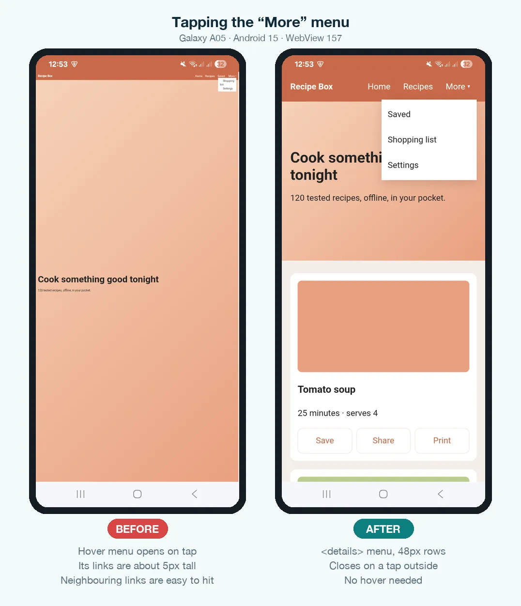
Don't put the menu inside a box with overflow set. Our first version gave the nav bar overflow-x: auto so the links could scroll. On the phone the menu opened, but it was invisible, because the nav bar cut off everything outside its own box. The emulator screenshots never showed the menu open, so only the phone caught it.
Keep hover effects for mice only, so a tapped card doesn't stay highlighted:
@media (hover: hover) {
  .card:hover { background: #fbf1ea; }
}
Step 6 — Contain anything wider than the screen
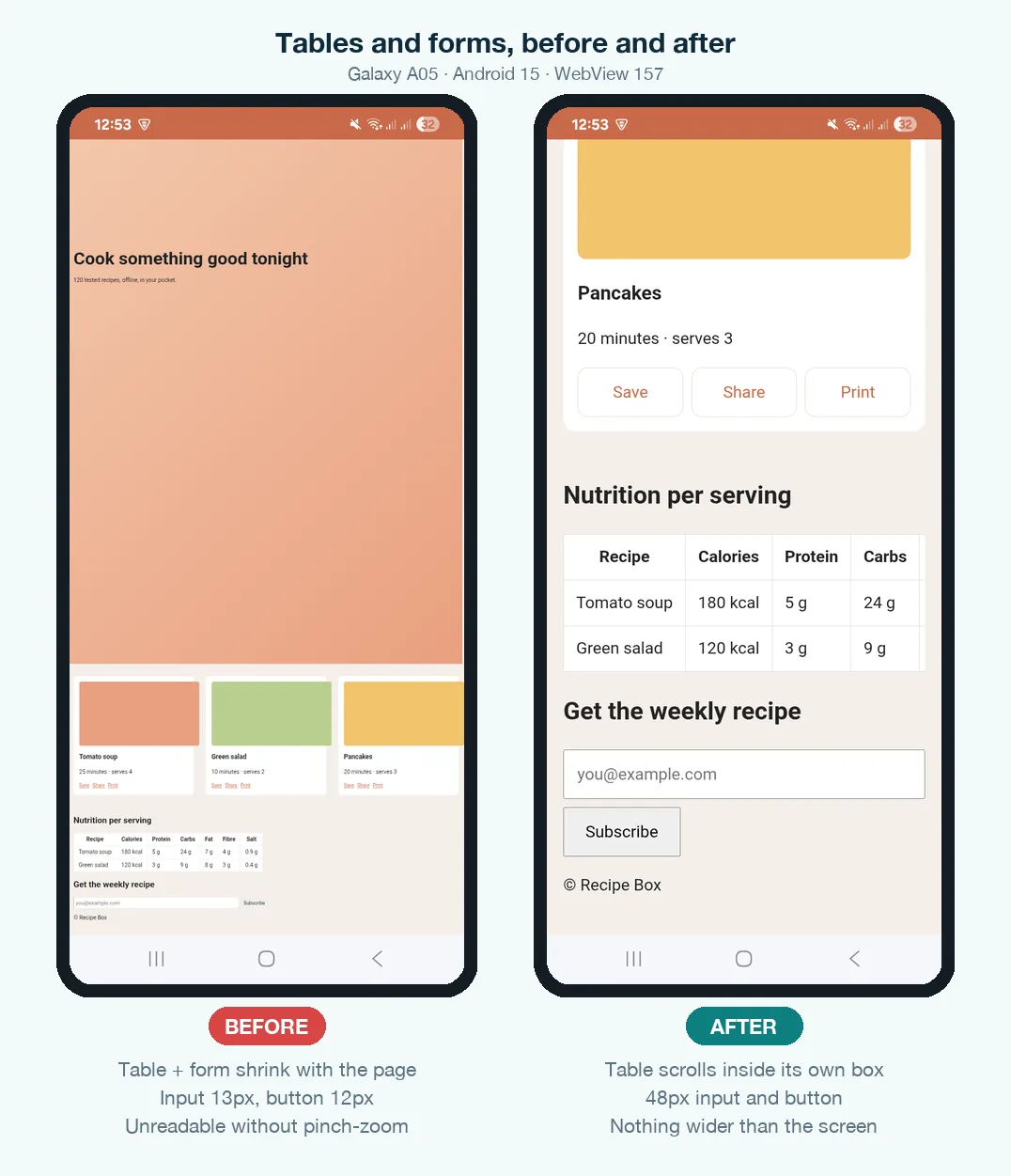
Some content can't shrink. A seven-column nutrition table, a long code sample or an unbroken URL will push the whole page sideways. Then every screen in the app wobbles left and right under the user's thumb. Give wide content its own scroll box, so the table scrolls and the page doesn't:
<div class="table-scroll"><table>…</table></div>

.table-scroll { overflow-x: auto; }
pre           { overflow-x: auto; }
p, li, td     { overflow-wrap: anywhere; }   /* long URLs and emails break instead of overflowing */
Step 7 — Plan for the keyboard
What happens when the keyboard opens depends on the app, so build a layout that copes either way.
- Apps that shrink their window for the keyboard. This is common in older apps and in some converters. The WebView gets shorter, and every
vhunit shrinks with it. We reproduced this in Chrome's emulator: aheight: 100vhhero dropped from 796px to 468px, and everything below it jumped up. The newersvhanddvhunits don't help, because they exist to handle a browser's address bar and an app doesn't have one. A60svhhero shrank from 480px to 282px in the same test. - Apps that keep their size. In our test app on the Galaxy A05, the WebView kept its height when the keyboard opened:
100vh,100svhand100dvhall stayed at 774px. Android scrolled the focused field up above the keyboard instead.
A hero sized with min-height: 300px stayed exactly 300px in both cases. So size decorative areas in fixed units, and never put a form inside a box sized to the screen height. Let login and sign-up screens grow with their content and scroll.
The zoomed-out page had a worse problem. Tapping its email field made the WebView jump from 39% to 100% zoom to show the field. The field then ran off the right edge, and the Subscribe button ended up off-screen.
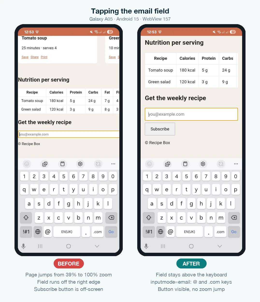
While you're in the form, help the keyboard too. Set font-size: 16px on inputs, add inputmode="email" or inputmode="numeric" so the right keyboard appears, and add autocomplete so Android can fill saved details.
<input type="email" inputmode="email" autocomplete="email">

input, button { min-height: 48px; font-size: 16px; }
Mobile-ready checklist
| Check | Fix | How to confirm |
|---|---|---|
| Viewport tag on every page | width=device-width, initial-scale=1 | window.innerWidth equals the phone width (360–412) |
| No sideways scroll | Fluid containers, max-width: 100% images | document.documentElement.scrollWidth equals innerWidth |
| Readable text | 16px body, clamp() headings | Read a paragraph at arm's length |
| Thumb-sized targets | min-height: 48px + padding | Tap every control with your thumb, not a fingertip |
| No hover-only UI | <details> or a tap handler | Open and close every menu by tapping |
| Wide content contained | overflow-x: auto wrappers | Rotate to portrait and look for wobble |
| Keyboard-safe forms | No vh heights around inputs | Tap into each field and watch the layout |
| No double padding | Skip env(safe-area-inset-*) if the app already avoids the system bars | Look for an empty band under the status bar on a real phone |
How to test before you build
Don't trust a narrow desktop browser window. Desktop Chrome lays every page out at the window's width whether or not it has a viewport tag, so the zoomed-out failure above can't happen there. A page with no tag looks perfect at 360px on a laptop and broken in the app. Use mobile emulation instead:
- Open the page in Chrome and press
F12(orCmd+Option+Ion a Mac). - Click the device toolbar icon, or press
Ctrl+Shift+M/Cmd+Shift+M. - Choose a phone preset, or set 360 × 800 by hand. Check the device type says Mobile, because that's what applies the 980px fallback.
- Reload, then repeat at 412px wide and in landscape.
- Finally, test inside a real app on a real Android phone. In our test, the phone caught three problems the emulator missed: a clipped dropdown, a 32px gap from safe-area insets, and different keyboard behaviour. To see what a passing page feels like, open our demo pages above on your phone.
Common mistakes
- Adding the viewport tag to
index.htmlonly. Every other page still opens zoomed out. - Disabling zoom to "feel more native". It fixes nothing and makes the app harder to use for anyone who needs larger text.
- A full-screen login form sized with
100vh. In apps that shrink their window for the keyboard, it's the exact layout that collapses. - Copying safe-area padding from a website. Inside an app that already avoids the system bars, it adds an empty band at the top and bottom.
- Hover tooltips holding important information. On a phone that text is unreachable. Put it on the page or behind a tap.
- Testing only in a resized desktop window. As shown above, that hides the most common failure completely.
What to do next
With the layout ready, check the rest of the project before you build. Make sure your folders and paths survive packaging, using the project structure guide. Then zip the site and follow converting a website ZIP into an Android app.