Your icon is the first thing anyone sees and the only thing they see every day afterwards, at about four millimetres across, next to thirty competitors. Android asks for it in six sizes and then reserves the right to crop it. Both facts should shape the design.
The sizes Android needs
| Folder | Size | Density |
|---|---|---|
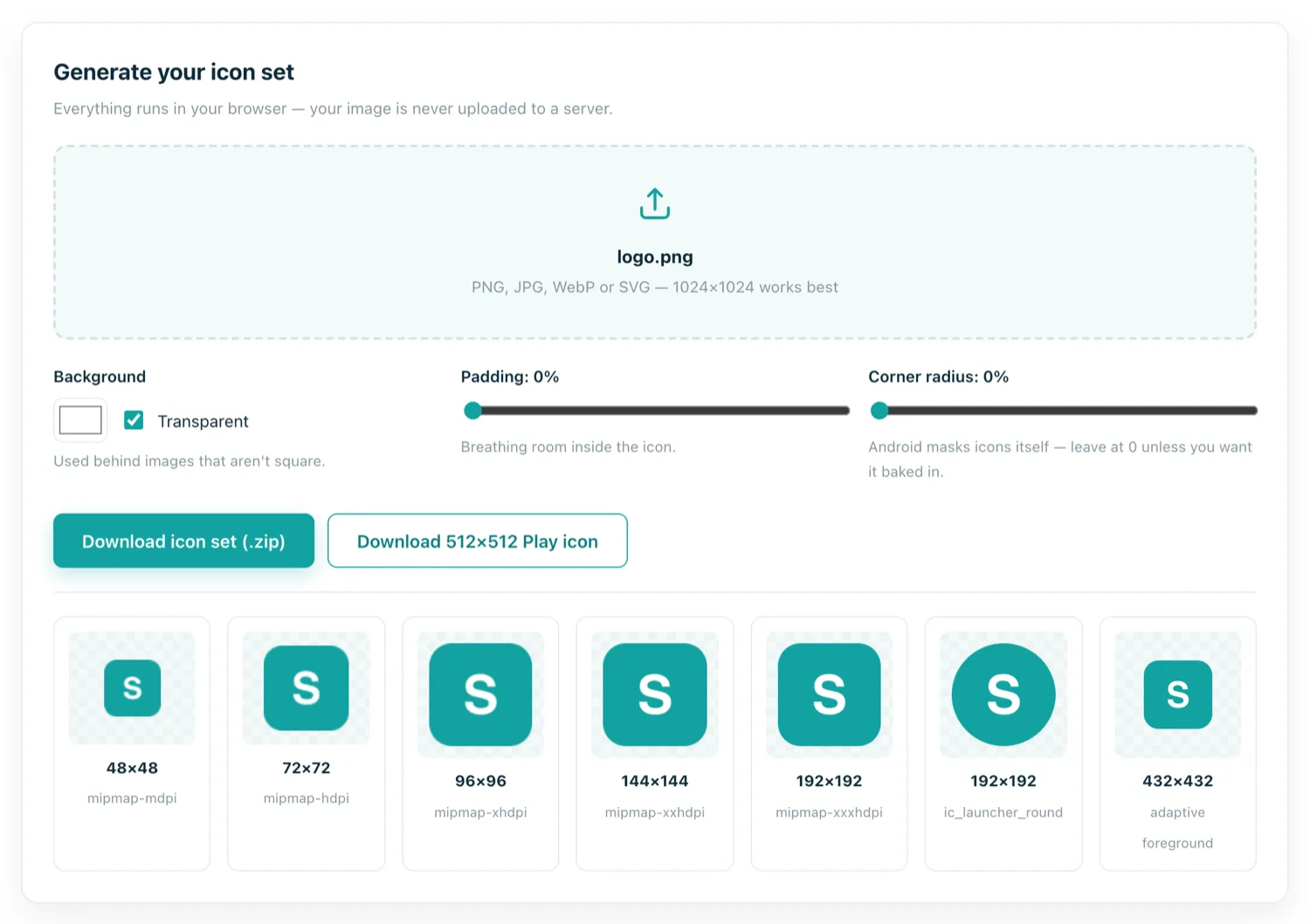
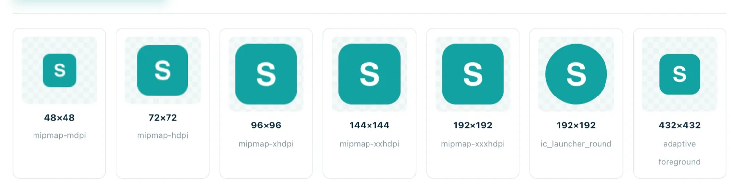
mipmap-mdpi | 48 × 48 | 1× baseline |
mipmap-hdpi | 72 × 72 | 1.5× |
mipmap-xhdpi | 96 × 96 | 2× |
mipmap-xxhdpi | 144 × 144 | 3× — most phones in use |
mipmap-xxxhdpi | 192 × 192 | 4× — flagships |
drawable | 432 × 432 | Adaptive icon foreground |
| Play Console | 512 × 512 | Store listing, no transparency |
They exist so the launcher can pick the right file rather than rescale one on every draw. Generating them from a single 1024×1024 master takes seconds.
Adaptive icons and the safe zone
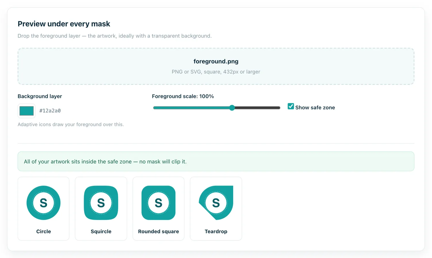
Since Android 8.0 the launcher decides your icon's shape: a circle on one phone, a squircle on another, a rounded square on a third. You provide a foreground layer on a 108dp canvas, and only the middle 72dp — about two thirds — is guaranteed visible. The rest can be cropped by the mask, and it moves during the parallax animation some launchers apply.
This is why converted-website icons so often look wrong: a full-bleed logo loses its corners under a circular mask. Design inside the safe zone and the mask becomes irrelevant.
Designing for 48 pixels
Everything about a good launcher icon follows from its real display size.
- One idea. A single mark, glyph or letterform. Scenes and illustrations turn to mud.
- No text. Your app's name is already printed under the icon. Words inside it are unreadable and read as noise.
- Never a screenshot. A shrunken picture of your website is the most common mistake in web-to-app conversions and looks exactly like what it is.
- Contrast against both wallpapers. Check it on white and on black. A dark logo on a transparent background disappears on a dark wallpaper.
- Flat. Baked-in shadows and bevels fight the launcher's own elevation effects and date badly.
- Distinct silhouette. People find apps by shape and colour before they read anything.
The Play Store icon is different
The 512×512 you upload to Play Console is a separate asset with its own rules: 32-bit PNG, no alpha channel, and no rounded corners of your own — Play applies its own masking and shadow. Upload a transparent PNG and it is rejected. Bake in a background colour instead.
Matching your web presence
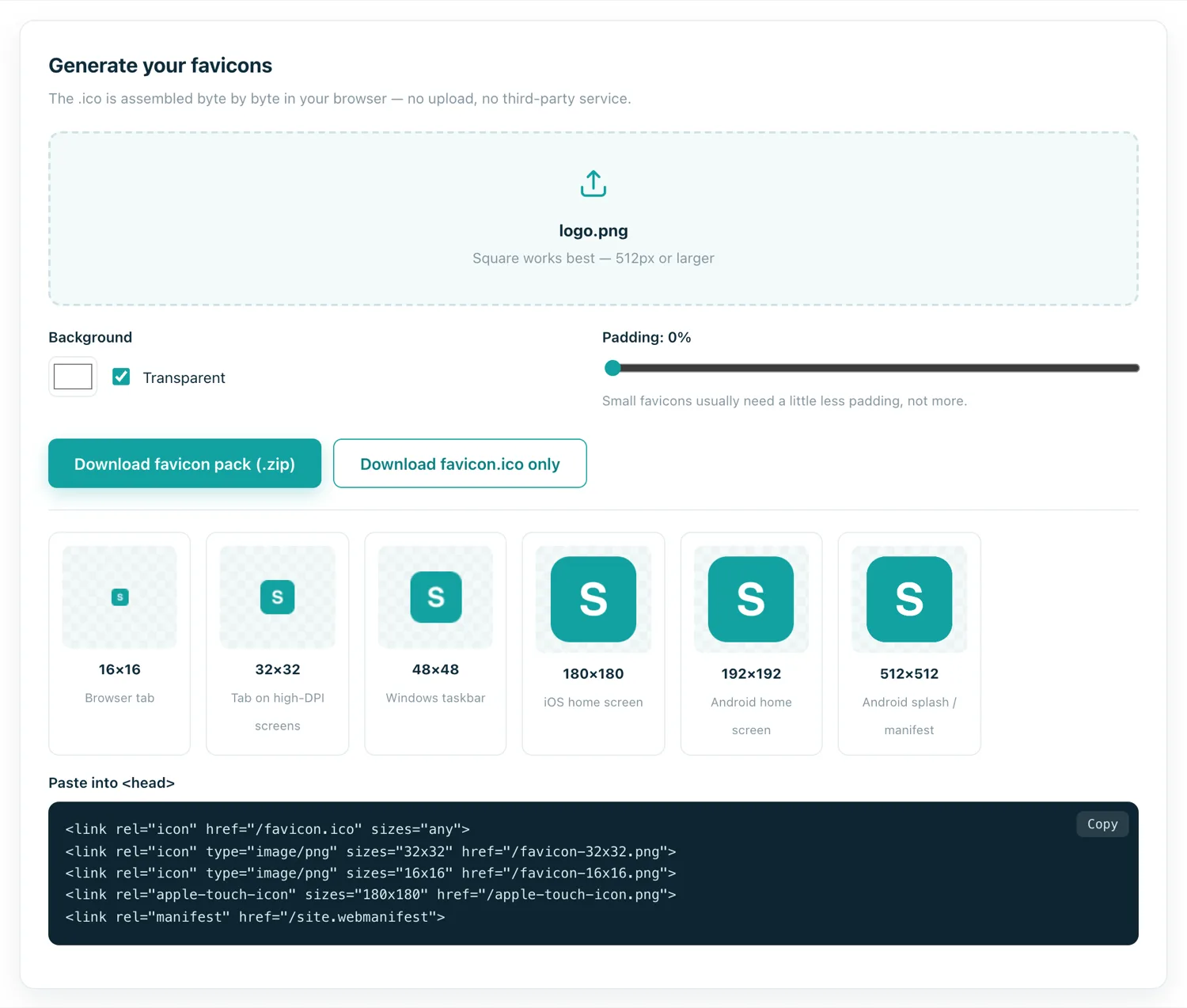
The app icon and the site's favicon should be recognisably the same mark. Someone who finds you in a browser and later in the Play Store should not have to wonder whether it is the same product — and reviewers do notice when a store listing looks unrelated to the site it wraps.
Common mistakes
- Starting too small. Upscaling a 128px logo to 512 produces visible softness. Start from vector art or the largest raster you have.
- Too much padding. Generous margins look considered at 512px and leave almost nothing at 48. Fill the safe zone.
- Baked-in rounded corners. Android already masks icons; adding your own gives you corners inside corners.
- Transparency on the Play icon. An instant upload rejection.
- A non-square source. A wide logo gets letterboxed with empty space above and below. Redraw it square.
Test before you ship
Put the icon on a real home screen next to other apps, on a light wallpaper and a dark one, and look at it from arm's length. If you cannot identify it in the time it takes to glance at a home screen, the design is not finished — no amount of correct pixel dimensions will fix that.